前言 近期需要开发一个编辑图片的小工具,所以借此机会继续补充一下之前的 WPF 教程。
后续内容只涉及几个常用库的使用,快速完成程序的开发以及打包发布,内容不会涉及底层的实现原理。
本次主要介绍使用 MahApps.Metro 控件库来美化程序。
创建项目 需要参考 WPF 系列教程:从 WPF (.NET Core) 开始 创建一个 WPF 的项目。
需要注意的是,要根据用户的使用场景来选择 .NET Framework 版本,我这里用户系统为 Windows 7,所以选择了 .NET Framework 4.0。
项目文件内容如下:
1 2 3 4 5 6 7 8 9 10 11 12 13 14 15 16 17 18 19 20 21 22 23 24 25 26 <Project Sdk ="Microsoft.NET.Sdk.WindowsDesktop" > <PropertyGroup > <OutputType > WinExe</OutputType > <TargetFrameworks > net40;net452</TargetFrameworks > <UseWPF > true</UseWPF > <ApplicationIcon > Resources\NotifyIconConnected.ico</ApplicationIcon > <ApplicationManifest > app.manifest</ApplicationManifest > <Platforms > AnyCPU;x86</Platforms > </PropertyGroup > <PropertyGroup Condition ="'$(Configuration)|$(Platform)'=='Debug|AnyCPU'" > <PlatformTarget > x86</PlatformTarget > </PropertyGroup > <ItemGroup > <Resource Include ="Resources\HostStopped.png" /> <Resource Include ="Resources\HostStarted.png" /> <Resource Include ="Resources\NotifyIconConnected.ico" /> <Resource Include ="Resources\NotifyIconDisconnected.ico" /> <Resource Include ="Resources\NotifyIconError.ico" /> <Resource Include ="Resources\ServiceDisconnected.png" /> <Resource Include ="Resources\ServiceConnected.png" /> </ItemGroup > </Project >
以上指定了一个 WPF 应用程序,编译的目标平台为 x86(我这里是方便调用一些基于 x86 发布的动态链接库,如果没有类似需求可以不指定)。
app.manifest 指定程序必须以管理员身份运行(我这里是用了这个很 LOW 的方法,避免程序安装在系统盘后因为 UAC 的原因,无法正常读写根目录的数据文件),内容如下:
1
2
3
4
5
6
7
8
9
10
11
12
13
14
15
16
17
18
19
<?xml version="1.0" encoding="utf-8"?> <assembly manifestVersion ="1.0" xmlns ="urn:schemas-microsoft-com:asm.v1" > <assemblyIdentity version ="1.0.0.0" name ="MyApplication.app" /> <trustInfo xmlns ="urn:schemas-microsoft-com:asm.v2" > <security > <requestedPrivileges xmlns ="urn:schemas-microsoft-com:asm.v3" > <requestedExecutionLevel level ="requireAdministrator" uiAccess ="false" /> </requestedPrivileges > <applicationRequestMinimum > <defaultAssemblyRequest permissionSetReference ="Custom" /> <PermissionSet class ="System.Security.PermissionSet" version ="1" ID ="Custom" SameSite ="site" Unrestricted ="true" /> </applicationRequestMinimum > </security > </trustInfo > <compatibility xmlns ="urn:schemas-microsoft-com:compatibility.v1" > <application > </application > </compatibility > </assembly >
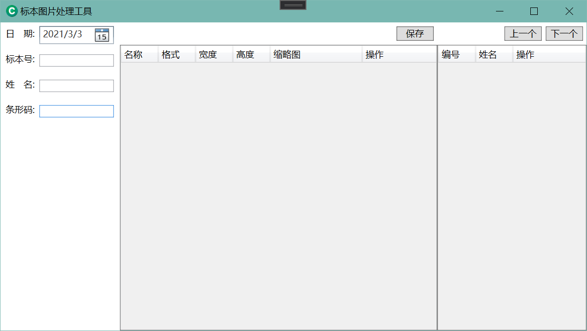
基本布局 按常规标本检验配置一个界面,左侧为标本信息编辑区,中间为结果区域,右侧为标本列表区。
按需求调整 MainWindow.xaml 内容如下:
1 2 3 4 5 6 7 8 9 10 11 12 13 14 15 16 17 18 19 20 21 22 23 24 25 26 27 28 29 30 31 32 33 34 35 36 37 38 39 40 41 42 43 44 45 46 47 48 49 50 51 52 53 54 55 56 57 58 59 60 61 62 63 64 65 66 67 68 69 70 71 72 73 74 75 76 77 78 79 80 81 82 83 84 85 86 87 88 89 90 91 92 93 94 95 96 97 98 99 100 101 102 103 104 105 106 107 108 109 110 111 112 113 114 115 116 117 118 119 120 121 122 123 124 125 126 127 128 129 130 131 132 133 134 135 136 137 138 139 140 141 142 143 144 145 146 147 148 149 150 151 152 153 154 155 156 157 158 159 160 161 162 163 164 165 166 167 168 169 170 171 172 173 174 175 176 177 178 179 180 181 182 183 184 185 186 187 188 189 190 191 192 193 194 195 196 197 198 199 200 201 202 203 204 205 206 207 208 209 210 211 212 213 214 215 216 217 218 219 220 221 222 223 224 225 226 227 228 229 230 231 232 233 234 235 236 237 238 239 240 241 242 243 244 245 246 247 248 249 250 251 252 253 254 <Window x:Class ="SampleImages.MainWindow" xmlns ="http://schemas.microsoft.com/winfx/2006/xaml/presentation" xmlns:x ="http://schemas.microsoft.com/winfx/2006/xaml" xmlns:d ="http://schemas.microsoft.com/expression/blend/2008" xmlns:mc ="http://schemas.openxmlformats.org/markup-compatibility/2006" mc:Ignorable ="d" Title ="标本图片处理工具" Height ="450" Width ="800" > <Grid > <Grid.ColumnDefinitions > <ColumnDefinition Width ="160" /> <ColumnDefinition Width ="*" /> <ColumnDefinition Width ="200" /> </Grid.ColumnDefinitions > <Grid > <Grid.RowDefinitions > <RowDefinition Height ="200" /> <RowDefinition Height ="*" /> <RowDefinition Height ="50" /> </Grid.RowDefinitions > <StackPanel > <StackPanel Height ="30" VerticalAlignment ="Center" HorizontalAlignment ="Left" Orientation ="Horizontal" Margin ="2" > <Label Width ="50" > 日 期:</Label > <DatePicker Width ="100" VerticalAlignment ="Center" > </DatePicker > </StackPanel > <StackPanel Height ="30" VerticalAlignment ="Center" HorizontalAlignment ="Left" Orientation ="Horizontal" Margin ="2" > <Label Width ="50" > 编 号:</Label > <TextBox Width ="100" VerticalAlignment ="Center" > </TextBox > </StackPanel > <StackPanel Height ="30" VerticalAlignment ="Center" HorizontalAlignment ="Left" Orientation ="Horizontal" Margin ="2" > <Label Width ="50" > 姓 名:</Label > <TextBox Width ="100" VerticalAlignment ="Center" > </TextBox > </StackPanel > <StackPanel Height ="30" VerticalAlignment ="Center" HorizontalAlignment ="Left" Orientation ="Horizontal" Margin ="2" > <Label Width ="50" > 条形码:</Label > <TextBox Width ="100" VerticalAlignment ="Center" > </TextBox > </StackPanel > </StackPanel > </Grid > <Grid Grid.Column ="1" > <Grid.RowDefinitions > <RowDefinition Height ="30" /> <RowDefinition Height ="*" /> </Grid.RowDefinitions > <StackPanel Grid.Row ="0" Orientation ="Horizontal" VerticalAlignment ="Center" HorizontalAlignment ="Right" Margin ="0 0 5 0" > <Button Width ="50" > 保存</Button > </StackPanel > <DataGrid Grid.Row ="1" CanUserAddRows ="False" SelectionMode ="Single" AutoGenerateColumns ="False" CanUserDeleteRows ="False" > <DataGrid.Columns > <DataGridTemplateColumn Header ="名称" Width ="50" > <DataGridTemplateColumn.CellTemplate > <DataTemplate > <TextBlock TextWrapping ="NoWrap" TextTrimming ="CharacterEllipsis" > </TextBlock > </DataTemplate > </DataGridTemplateColumn.CellTemplate > </DataGridTemplateColumn > <DataGridTextColumn Header ="格式" Width ="50" IsReadOnly ="True" /> <DataGridTextColumn Header ="宽度" Width ="50" IsReadOnly ="True" /> <DataGridTextColumn Header ="高度" Width ="50" IsReadOnly ="True" /> <DataGridTextColumn Header ="缩略图" Width ="100" /> <DataGridTemplateColumn Header ="操作" Width ="*" > <DataGridTemplateColumn.CellTemplate > <DataTemplate > <StackPanel Orientation ="Horizontal" > <Button Name ="btnInput" Content ="修改" Cursor ="Hand" > <Button.Template > <ControlTemplate TargetType ="Button" > <TextBlock TextDecorations ="Underline" > <ContentPresenter /> </TextBlock > </ControlTemplate > </Button.Template > <Button.Style > <Style TargetType ="Button" > <Setter Property ="Foreground" Value ="Blue" /> <Style.Triggers > <Trigger Property ="IsMouseOver" Value ="true" > <Setter Property ="Foreground" Value ="Red" /> </Trigger > </Style.Triggers > </Style > </Button.Style > </Button > <Button Name ="btnCancel" Content ="删除" Margin ="10 0 0 0" Cursor ="Hand" > <Button.Template > <ControlTemplate TargetType ="Button" > <TextBlock TextDecorations ="Underline" > <ContentPresenter /> </TextBlock > </ControlTemplate > </Button.Template > <Button.Style > <Style TargetType ="Button" > <Setter Property ="Foreground" Value ="Blue" /> <Style.Triggers > <Trigger Property ="IsMouseOver" Value ="true" > <Setter Property ="Foreground" Value ="Red" /> </Trigger > </Style.Triggers > </Style > </Button.Style > </Button > </StackPanel > </DataTemplate > </DataGridTemplateColumn.CellTemplate > </DataGridTemplateColumn > </DataGrid.Columns > </DataGrid > </Grid > <Grid Grid.Column ="1" > <Grid.RowDefinitions > <RowDefinition Height ="30" /> <RowDefinition Height ="*" /> </Grid.RowDefinitions > <StackPanel Grid.Row ="0" Orientation ="Horizontal" VerticalAlignment ="Center" HorizontalAlignment ="Right" Margin ="0 0 5 0" > <Button Width ="50" > 保存</Button > </StackPanel > <DataGrid Grid.Row ="1" CanUserAddRows ="False" SelectionMode ="Single" AutoGenerateColumns ="False" CanUserDeleteRows ="False" BorderBrush ="Gray" BorderThickness ="1" > <DataGrid.Columns > <DataGridTemplateColumn Header ="名称" Width ="50" > <DataGridTemplateColumn.CellTemplate > <DataTemplate > <TextBlock TextWrapping ="NoWrap" TextTrimming ="CharacterEllipsis" > </TextBlock > </DataTemplate > </DataGridTemplateColumn.CellTemplate > </DataGridTemplateColumn > <DataGridTextColumn Header ="格式" Width ="50" IsReadOnly ="True" /> <DataGridTextColumn Header ="宽度" Width ="50" IsReadOnly ="True" /> <DataGridTextColumn Header ="高度" Width ="50" IsReadOnly ="True" /> <DataGridTextColumn Header ="缩略图" Width ="*" /> <DataGridTemplateColumn Header ="操作" Width ="100" > <DataGridTemplateColumn.CellTemplate > <DataTemplate > <StackPanel Orientation ="Horizontal" > <Button Name ="btnInput" Content ="修改" Cursor ="Hand" > <Button.Template > <ControlTemplate TargetType ="Button" > <TextBlock TextDecorations ="Underline" > <ContentPresenter /> </TextBlock > </ControlTemplate > </Button.Template > <Button.Style > <Style TargetType ="Button" > <Setter Property ="Foreground" Value ="Blue" /> <Style.Triggers > <Trigger Property ="IsMouseOver" Value ="true" > <Setter Property ="Foreground" Value ="Red" /> </Trigger > </Style.Triggers > </Style > </Button.Style > </Button > <Button Name ="btnCancel" Content ="删除" Margin ="10 0 0 0" > <Button.Template > <ControlTemplate TargetType ="Button" > <TextBlock TextDecorations ="Underline" > <ContentPresenter /> </TextBlock > </ControlTemplate > </Button.Template > <Button.Style > <Style TargetType ="Button" > <Setter Property ="Foreground" Value ="Blue" /> <Style.Triggers > <Trigger Property ="IsMouseOver" Value ="true" > <Setter Property ="Foreground" Value ="Red" /> </Trigger > </Style.Triggers > </Style > </Button.Style > </Button > </StackPanel > </DataTemplate > </DataGridTemplateColumn.CellTemplate > </DataGridTemplateColumn > </DataGrid.Columns > </DataGrid > </Grid > <Grid Grid.Column ="2" > <Grid.RowDefinitions > <RowDefinition Height ="30" /> <RowDefinition Height ="*" /> </Grid.RowDefinitions > <StackPanel Grid.Row ="0" Orientation ="Horizontal" VerticalAlignment ="Center" HorizontalAlignment ="Right" Margin ="0 0 5 0" > <Button Width ="50" > 上一个</Button > <Button Width ="50" Margin ="5 0 0 0" > 下一个</Button > </StackPanel > <DataGrid Grid.Row ="1" CanUserAddRows ="False" SelectionMode ="Single" AutoGenerateColumns ="False" CanUserDeleteRows ="False" BorderBrush ="Gray" BorderThickness ="1" > <DataGrid.Columns > <DataGridTemplateColumn Header ="编号" Width ="50" > <DataGridTemplateColumn.CellTemplate > <DataTemplate > <TextBlock TextWrapping ="NoWrap" TextTrimming ="CharacterEllipsis" > </TextBlock > </DataTemplate > </DataGridTemplateColumn.CellTemplate > </DataGridTemplateColumn > <DataGridTemplateColumn Header ="姓名" Width ="50" > <DataGridTemplateColumn.CellTemplate > <DataTemplate > <TextBlock TextWrapping ="NoWrap" TextTrimming ="CharacterEllipsis" > </TextBlock > </DataTemplate > </DataGridTemplateColumn.CellTemplate > </DataGridTemplateColumn > <DataGridTemplateColumn Header ="操作" Width ="*" > <DataGridTemplateColumn.CellTemplate > <DataTemplate > <StackPanel Orientation ="Horizontal" > <Button Name ="btnInput" Content ="修改" Cursor ="Hand" > <Button.Template > <ControlTemplate TargetType ="Button" > <TextBlock TextDecorations ="Underline" > <ContentPresenter /> </TextBlock > </ControlTemplate > </Button.Template > <Button.Style > <Style TargetType ="Button" > <Setter Property ="Foreground" Value ="Blue" /> <Style.Triggers > <Trigger Property ="IsMouseOver" Value ="true" > <Setter Property ="Foreground" Value ="Red" /> </Trigger > </Style.Triggers > </Style > </Button.Style > </Button > <Button Name ="btnCancel" Content ="删除" Margin ="10 0 0 0" Cursor ="Hand" > <Button.Template > <ControlTemplate TargetType ="Button" > <TextBlock TextDecorations ="Underline" > <ContentPresenter /> </TextBlock > </ControlTemplate > </Button.Template > <Button.Style > <Style TargetType ="Button" > <Setter Property ="Foreground" Value ="Blue" /> <Style.Triggers > <Trigger Property ="IsMouseOver" Value ="true" > <Setter Property ="Foreground" Value ="Red" /> </Trigger > </Style.Triggers > </Style > </Button.Style > </Button > </StackPanel > </DataTemplate > </DataGridTemplateColumn.CellTemplate > </DataGridTemplateColumn > </DataGrid.Columns > </DataGrid > </Grid > </Grid > </Window >
预览效果如下:
开始美化 首先需要引用 MahApps.Metro 以及 MahApps.Metro.IconPacks,第二个是图标库,如果不需要可以不添加引用。
项目文件中添加如下内容(也可以通过 NuGet 包管理器查找引用到项目):
1 2 3 4 <ItemGroup > <PackageReference Include ="MahApps.Metro" Version ="1.6.5" /> <PackageReference Include ="MahApps.Metro.IconPacks" Version ="2.3.0" /> </ItemGroup >
控件包引用到项目后,需要绑定资源字典,修改 App.Xaml 文件中 Application.Resources 节点,添加以下内容:
1 2 3 4 5 6 7 8 9 10 11 <ResourceDictionary > <ResourceDictionary.MergedDictionaries > <ResourceDictionary Source ="pack://application:,,,/MahApps.Metro;component/Styles/Controls.xaml" /> <ResourceDictionary Source ="pack://application:,,,/MahApps.Metro;component/Styles/Fonts.xaml" /> <ResourceDictionary Source ="pack://application:,,,/MahApps.Metro;component/Styles/Colors.xaml" /> <ResourceDictionary Source ="pack://application:,,,/MahApps.Metro;component/Styles/Accents/Purple.xaml" /> <ResourceDictionary Source ="pack://application:,,,/MahApps.Metro;component/Styles/Accents/BaseLight.xaml" /> </ResourceDictionary.MergedDictionaries > </ResourceDictionary >
然后调整 MainWindow 的继承,修改 MainWindow.xaml.cs 文件,将继承由 Window 修改为 MetroWindow。
同样的修改 MainWindow.xaml 文件,增加命名空间 xmlns:Controls="clr-namespace:MahApps.Metro.Controls;assembly=MahApps.Metro",修改父节点 Window 为 Controls:MetroWindow。
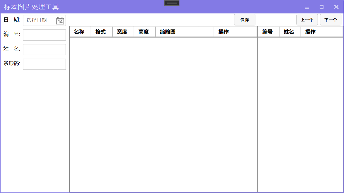
此时基本的美化已经完成了,可以运行程序查看美化后的效果:
以上内容可以参考官方文档:MahApps.Metro - Quick Start ,可以看到更详细的说明。
其他 使用弹窗 MahApps.Metro 提供了多种弹窗方式,包括加载中提示、消息提示、输入框弹窗、登录弹窗等。
需要注意的是,使用这些功能需要使用 async/await 关键字,因为项目使用的是 .NET Framework 4.0,这个版本还不支持这两个关键字,所以需要引用 AsyncBridge。
选用 AsyncBridge 而不是官方提供的 Microsoft.Bcl.Async,是因为官方提供的包还需要为 Windows XP 以及 Windows 7 系统打补丁(KB2468871)才可以使用。
我们为 保存 按钮增加一个点击事件,用于演示此功能,点击事件绑定方法内容如下:
1
2
3
4
5
6
7
8
9
10
11
12
13
14
15
16
17
18
19
20
21
22
23
24
25
private async void Button_Click (object sender, RoutedEventArgs e string name = await this .ShowInputAsync("注册" , "请输入注册用户名!" ); var data = await this .ShowLoginAsync("注册" , "请输入注册用户名以及密码!" , new LoginDialogSettings { InitialUsername = name, AffirmativeButtonText = "注册" }); if (string .IsNullOrWhiteSpace(data.Username) || string .IsNullOrWhiteSpace(data.Password)) { await this .ShowMessageAsync("警告s" , $"注册用户名称与密码不能为空!" ); } var controller = await this .ShowProgressAsync("请稍候" , $"正在获取用户[{data.Username} ]注册结果!" , true ); controller.SetIndeterminate(); controller.Canceled += new EventHandler(async (obj, args) => { await controller.CloseAsync(); await this .ShowMessageAsync("提示" , $"您已取消了用户注册!" ); }); }
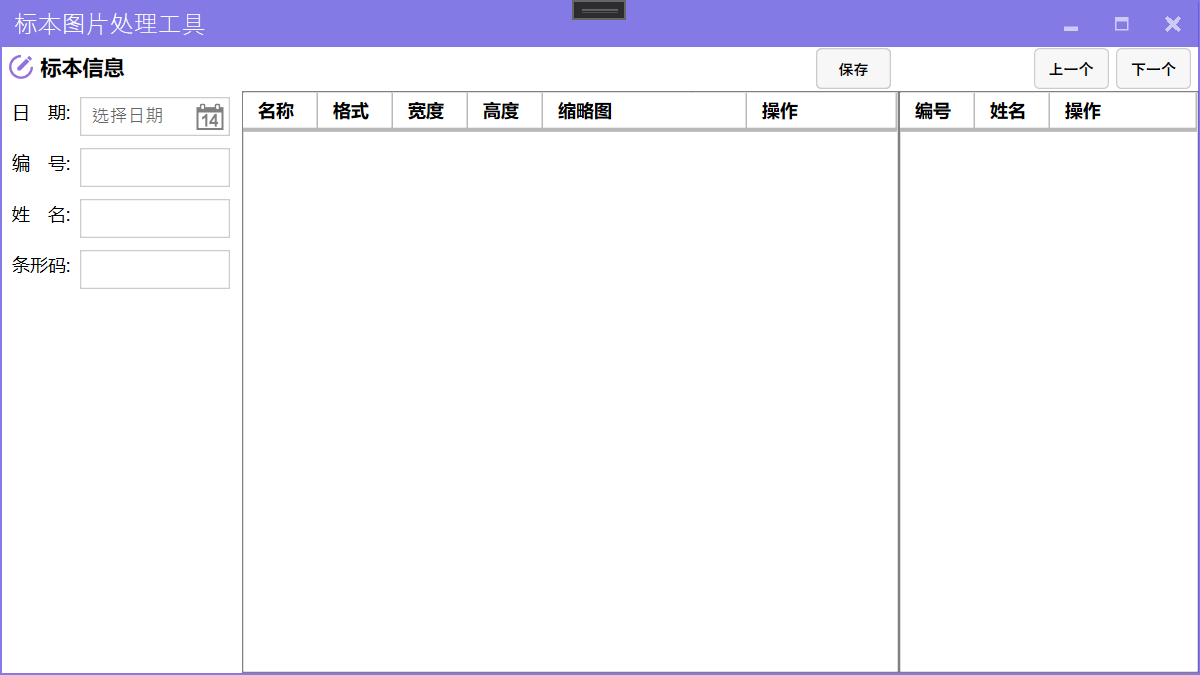
最终实现的效果如下:
使用图标 前文已经引用了 MahApps.Metro.IconPacks,但是如果想要使用,还需要添加命名空间:xmlns:iconPacks="http://metro.mahapps.com/winfx/xaml/iconpacks"。
使用图标可以丰富页面内容,如本程序中在标本信息编辑区增加一个说明信息。
1 2 3 4 5 6 7 8 9 10 <Controls:MetroHeader Margin ="5" Header ="TextBox Header" Grid.ColumnSpan ="2" > <Controls:MetroHeader.HeaderTemplate > <DataTemplate > <StackPanel VerticalAlignment ="Center" Orientation ="Horizontal" > <iconPacks:PackIconMaterial VerticalAlignment ="Center" Kind ="CircleEditOutline" Foreground ="MediumPurple" /> <TextBlock Margin ="5 0 0 0" VerticalAlignment ="Center" FontWeight ="Bold" Text ="标本信息" /> </StackPanel > </DataTemplate > </Controls:MetroHeader.HeaderTemplate > </Controls:MetroHeader >